jhoomti shaam
about jhoomti shaam
“A BOLLYWOOD-FUSION COMPETITION: RUN BY DANCERS, FOR DANCERS. Hosted by the official Bollywood and Hindi-Film Dance team, UCLA Nashaa, Jhoomti Shaam has celebrated the South Asian community through expression of art and dance. For the past 17 years, Jhoomti Shaam has strived to serve as a beacon of cultural awareness for the South Asian community and its allies. Our competition and dancers, no matter what race, color, creed, or class, understand the cultural misrepresentations of the South Asian community pervasive in our world. Jhoomti Shaam encourages the courage and strength displayed by the stories that dance teams from all over the country bring to our stage. These dancers are committed to sharing their spark of hope with the world, and we are more than humbled to be a part of their journey. After all, Jhoomti Shaam is where stars are born.”
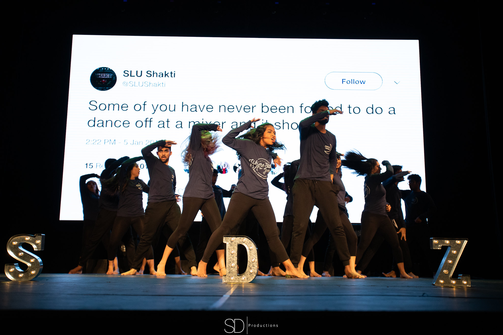
i was contracted to create a new, clean identity for this competition as it was entering its 17th year. i designed apparel and merchandise for over 200 dancers and board members.
the logo
their tagline, “where stars are born” is the inspiration for a bulk of the refresh. the minimal line work is a common theme throughout the branding and the fonts were chosen as a pairing in order bring a sense of connectivity within the logo.
secondary logo
this design was inspired by jhoomti shaam’s current branding style. using the moon as a symbol, i wanted to add more geometric visuals with a unique wave to break the harsh angles.
merchandise & apparel
a combination of the two logos were utilized in creating the gear. the primary logo was made for the back of the shirt which came in navy, and the secondary logo was put on all smaller trinkets such as the water bottle, shot glass, and a drawstring bag.